REBRANDING AN ICON: THE BAKER’S SECRET BAKEWARE PROJECT
REBRANDING AN ICON: THE BAKER’S SECRET BAKEWARE PROJECT
When you think of classic bakeware brands, Baker’s Secret has truly stood the test of time. With roots dating back to the late 19th century and an official brand launch in 1972, it has been a kitchen staple for generations. So when we had the opportunity to refresh their branding across North and South America, we knew it was going to be something special.
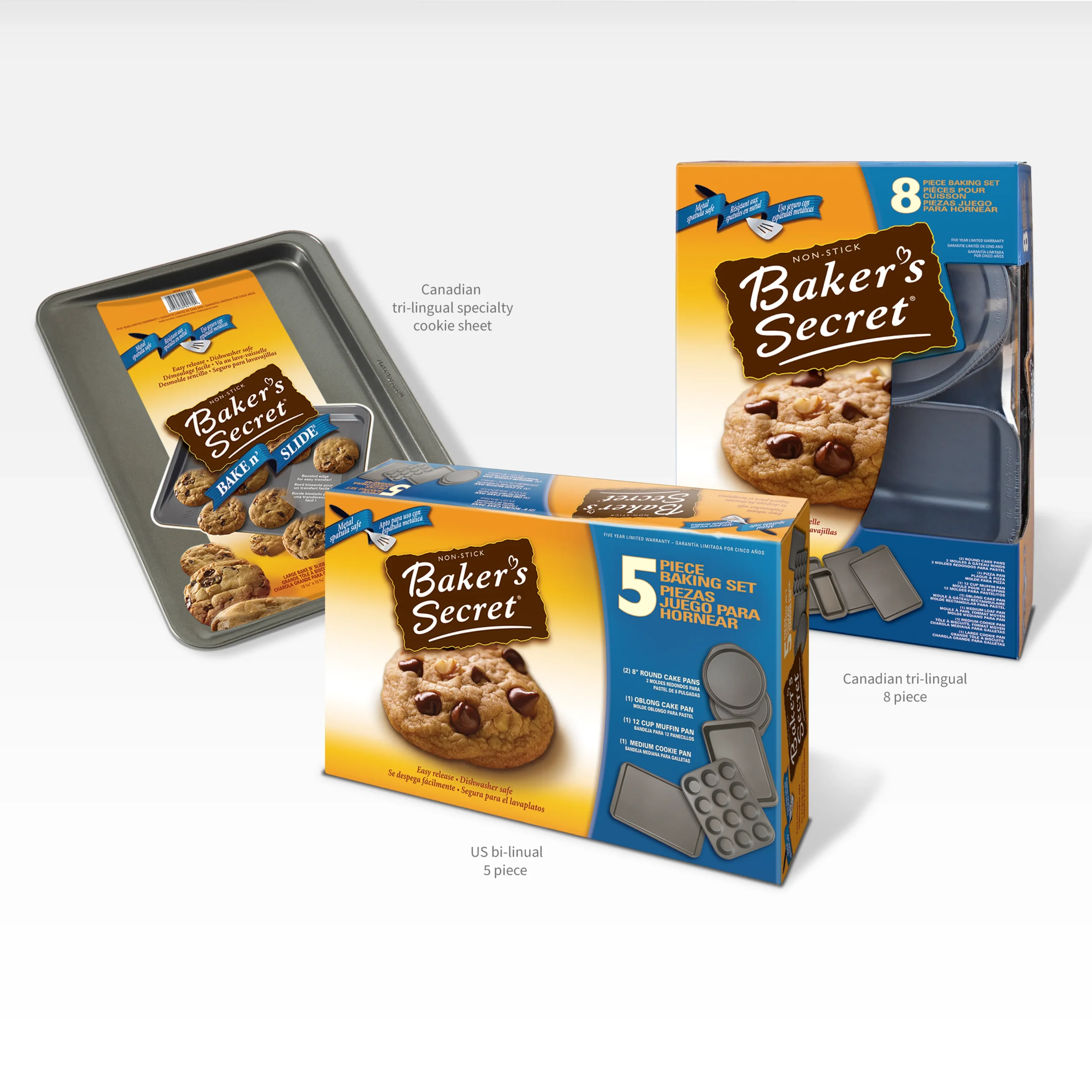
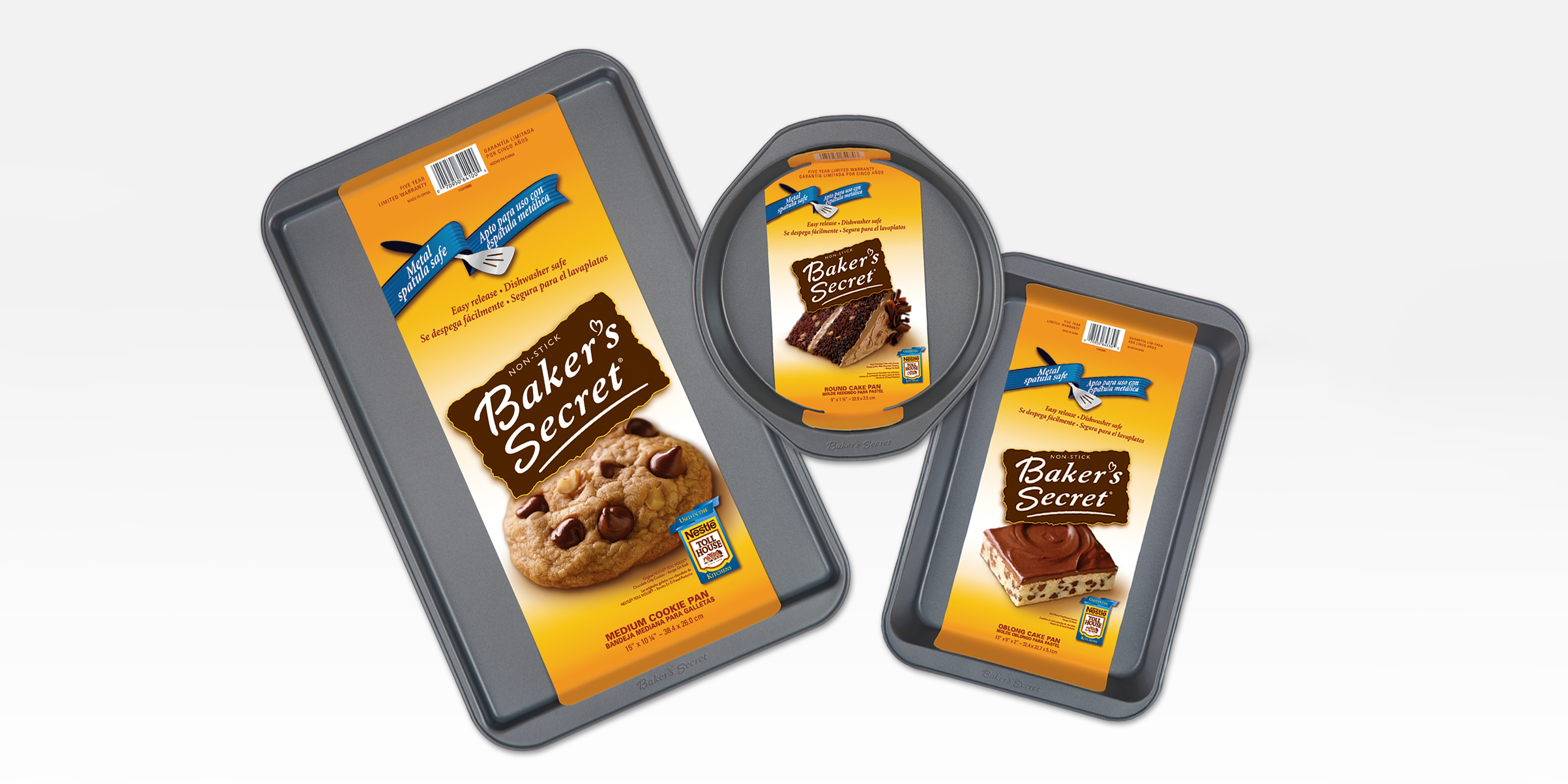
Like every project, it all starts with a conversation. We dive into everything: brand identity, market positioning, retailer requirements, and, of course, the client’s vision. From there, the concept design takes shape, and what better product to showcase it on than their flagship baking sheet? This became the foundation for the new brand direction, one that felt warm, fresh, and inviting, like a batch of homemade cookies straight from the oven.
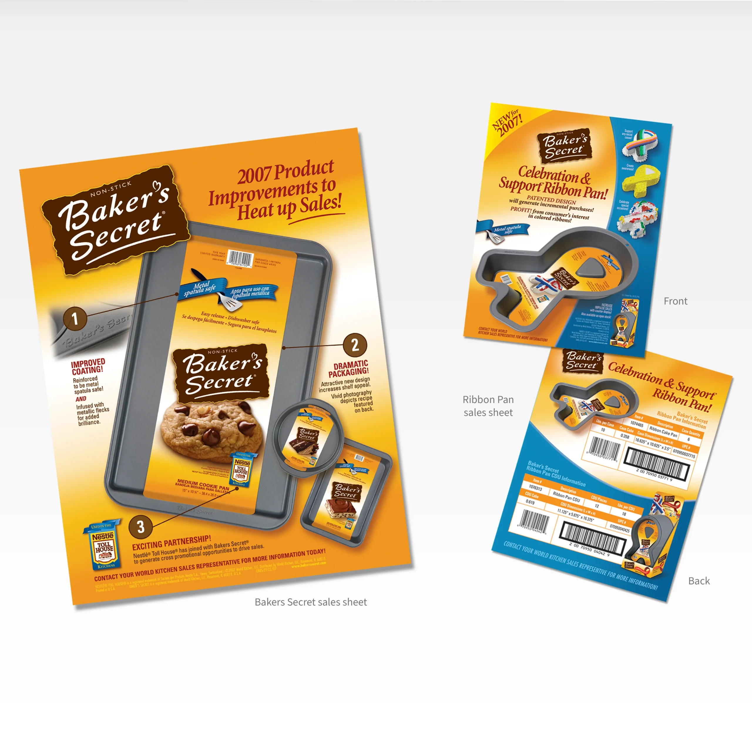
Of course, no rebrand is without its challenges. Designing is one thing, but execution is another. With over 170 SKUs to apply the new branding to, precision was key. The biggest hurdle? Print production was happening overseas, where there wasn’t always someone onsite with the brand’s interest in mind when it came to colour accuracy.
Our solution? Color-accurate proofs. Every artwork file was paired with a high-quality proof that was 90-95% colour accurate, ensuring that Baker’s Secret’s brand colours and design details were locked in from the start. This extra step eliminated guesswork for the printers, guaranteeing that every single package looked exactly as intended, no surprises, no compromises.
Being part of this rebranding journey was an absolute honour, and I’m beyond proud of the results. When it comes to bringing big brands to life, attention to detail makes all the difference.
If your brand needs a refresh, whatever the industry or service you provide, let’s chat! Because a strong brand isn’t just about looking good; it’s about making an impact.