GOOD DESIGN IS TIMELESS: REVISITING A CLASSIC; CORNINGWARE STOVETOP
GOOD DESIGN IS TIMELESS: REVISITING A CLASSIC; CORNINGWARE STOVETOP
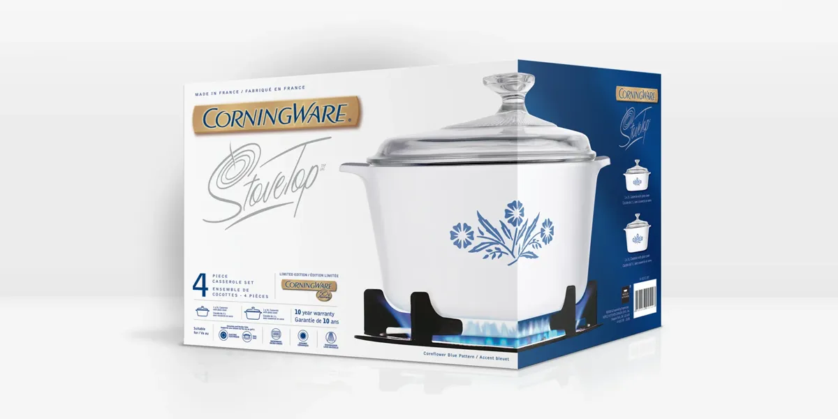
Some designs just stand the test of time, and CorningWare’s StoveTop packaging featuring the iconic Cornflower Blue Pattern is the perfect example. First introduced in 1958, this beloved pattern became a kitchen staple in homes across North America for decades. Fast forward to 2009, when I had the honour of designing the reintroduced CorningWare StoveTop packaging for World Kitchen Canada, celebrating this timeless pattern.
This product release came as two options for the Canadian market, available in French White or the iconic Cornflower Blue. To help propel this packaging, we proposed a custom logo specifically for this product line. The logo combined the present CorningWare word mark with a personified “StoveTop,” stylized in a handwritten font with a playful depiction of a traditional stovetop burner extending from the top of the capital “S.”
Nearly 20 years later, I’m still so proud of this design; and I think it still looks fresh and relevant today! This project was all about honouring a rich heritage while giving it a crisp, modern feel. And that’s the beauty of great design: it connects to history while continuing to inspire across generations.
P.S. Sharing more of our work and creative thoughts is what my “Headlines” blog on my website is all about. Stay tuned for more behind-the-scenes inspiration!